Function:
The function of the gallery flows very well; a path is
created to weave through the piece of art on display. The only hazard I could
foresee is the loose rolling oranges on the floor. If a viewer was not paying
attention to where they are stepping they could easily step on one with could
either cause them to trip or create a huge mess in the gallery. Besides this
point everything is set up at eye level for those standing at the average
height as well as the typography being set up to a perfect high and size.
Formal:
The gallery has a flow to it that isn’t from the pieces
being like-minded but more so that they are celebrating each artist in a cohesive
display. The typography, I believe is written in a times new roman font at just
a big enough size to be noticeably read and understood. Yes I have seen some
poorly done typography in some galleries before, usually they make their font
size way to small to read. I don’t believe there is necessarily a style between
each piece.
The exhibit portrays a message of different works combined
in the same setting, causing it to flow like a collage of works. As stated
before I believe that the gallery has a fluid sequence, you don’t necessarily
have to follow the gallery like a book from point A to point B. Which I
believe, works rather well in a large gallery setting.
Visitor:
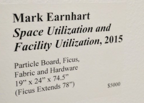
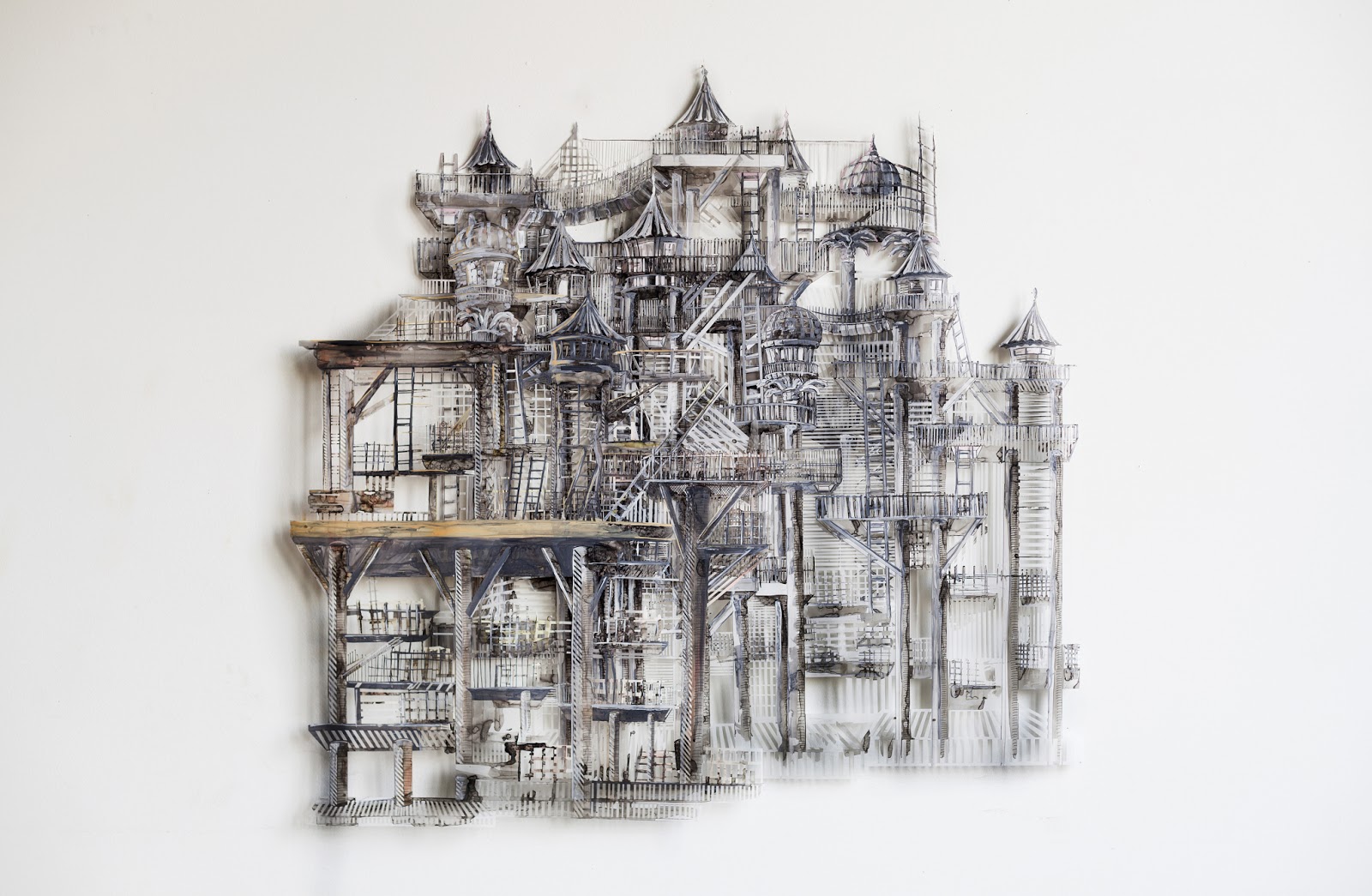
I think that young children would enjoy Marks piece the most
because its interactive and touchable. However they might find difficulty
understanding Neil’s paintings because they are abstract. While for teenagers I
think the kites would be very popular by John Pollack the bright colors do
while this that age. However I think that JJ’s sound system in the back might
not be stimulating enough. As for young adults I think Jodi’s would be the most
engaging. I think viewers can share their experience though word of mouth and
photography very easily. As for the gallery itself I would take the carpet out
of the area and make the ceiling all the same height but taller then they are
now.